Feral Brewing: Designing a typographic language for the rewilding of the WA craft brewery.
Feral Brewing
Brand identity, label design, illustration and custom typefaces.
2025
A year ago, Feral brewing took back control. After more than two decades of pushing boundaries, and getting a little too weird, they took a detour from their wild roots. But now, they’re back where they belong. They’re out. They’re independent. And they’re marking this moment with a completely refreshed brand. This is a reintroduction. A rewilding.
Under the creative direction of DDDDDDD, Swim Type designed an extensive typographic language to house the new stories the brand wanted to tell, drawing on the energy that made Feral what it was in the first place; the attitude, the experimentation, the chaos.


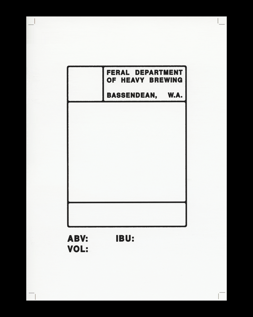
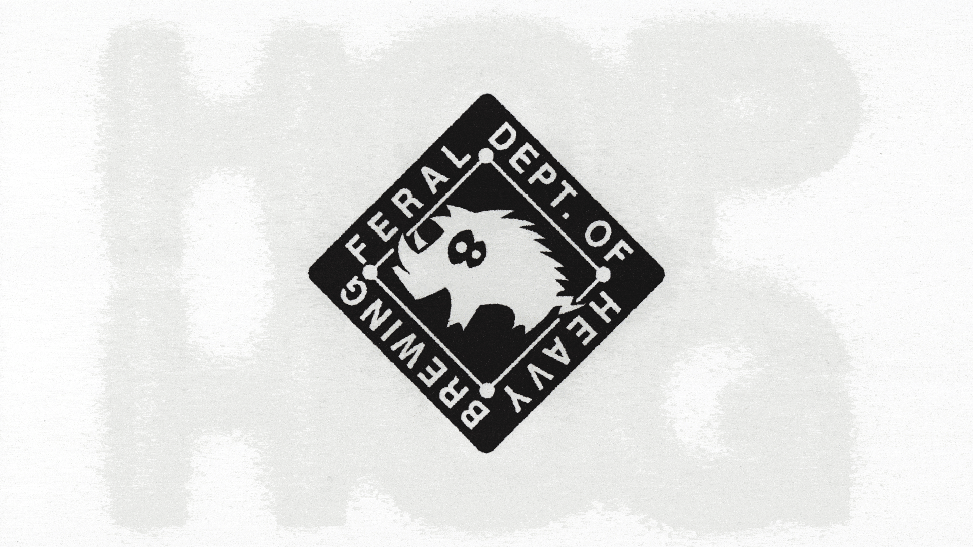

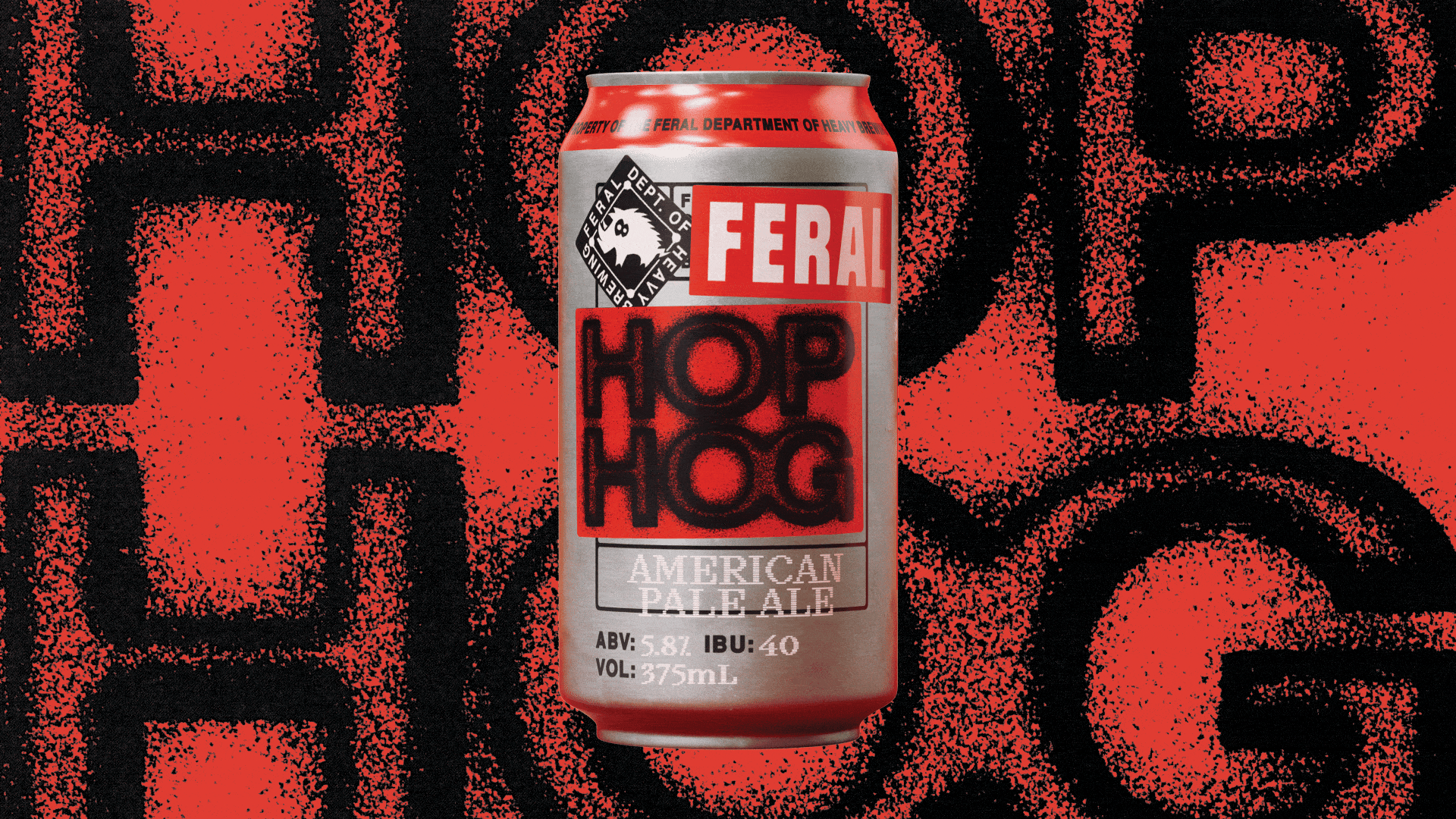
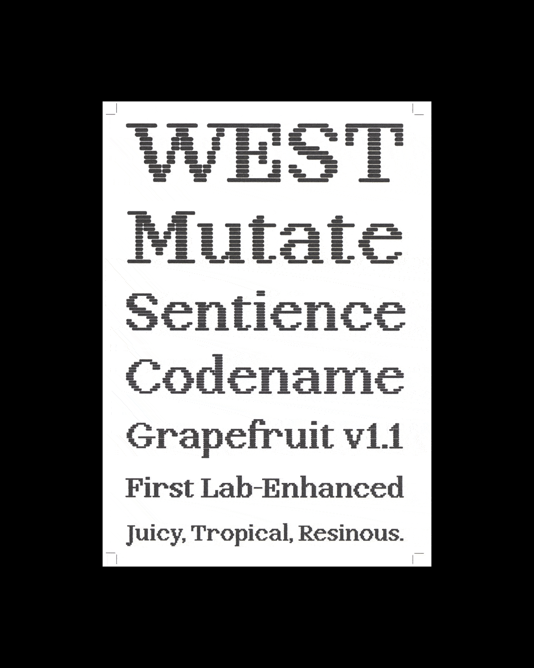
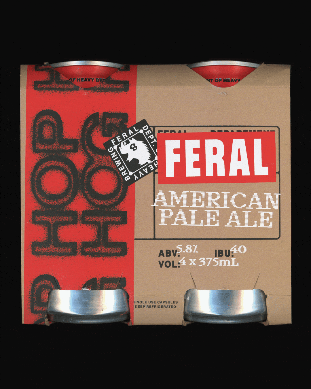
A whole new world inside Feral was developed: departments like the Department of Heavy Brewing, the Department of Experimental Brewing, and the Department of Propaganda — all fictional (but also very real), and all dedicated to creating bigger, bolder, stranger beers.
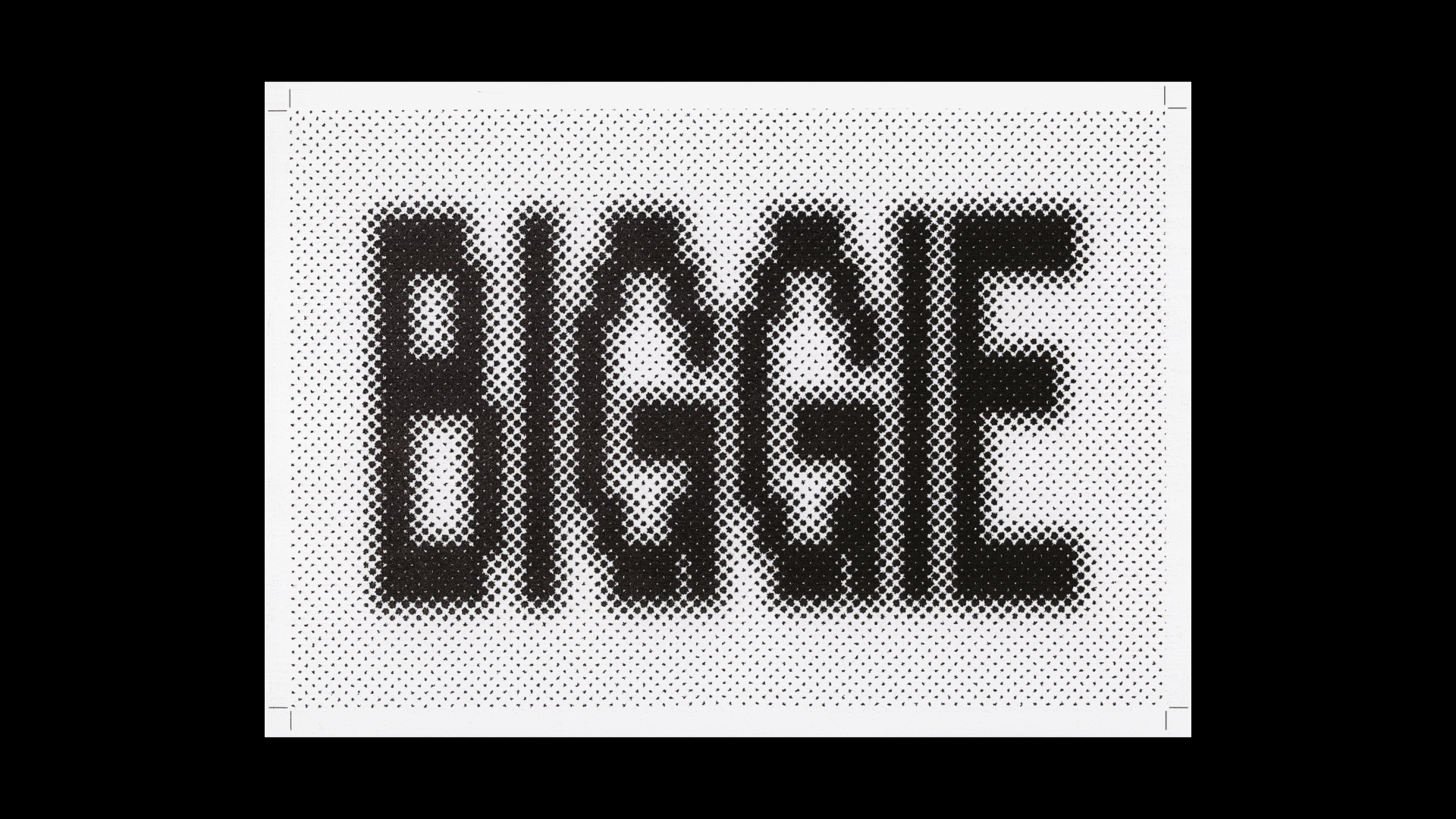
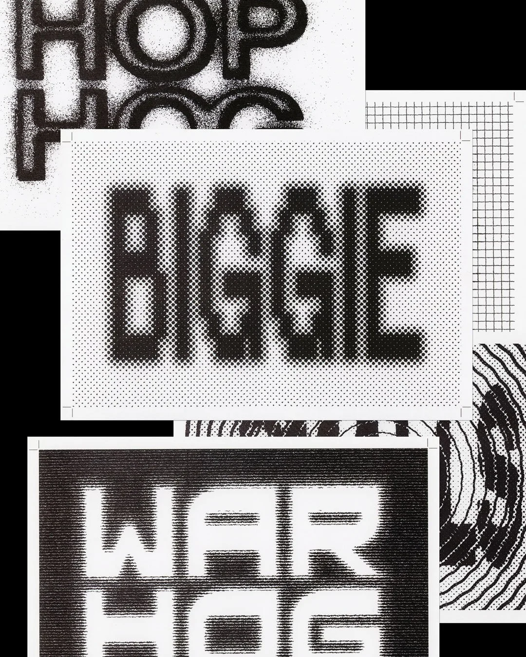
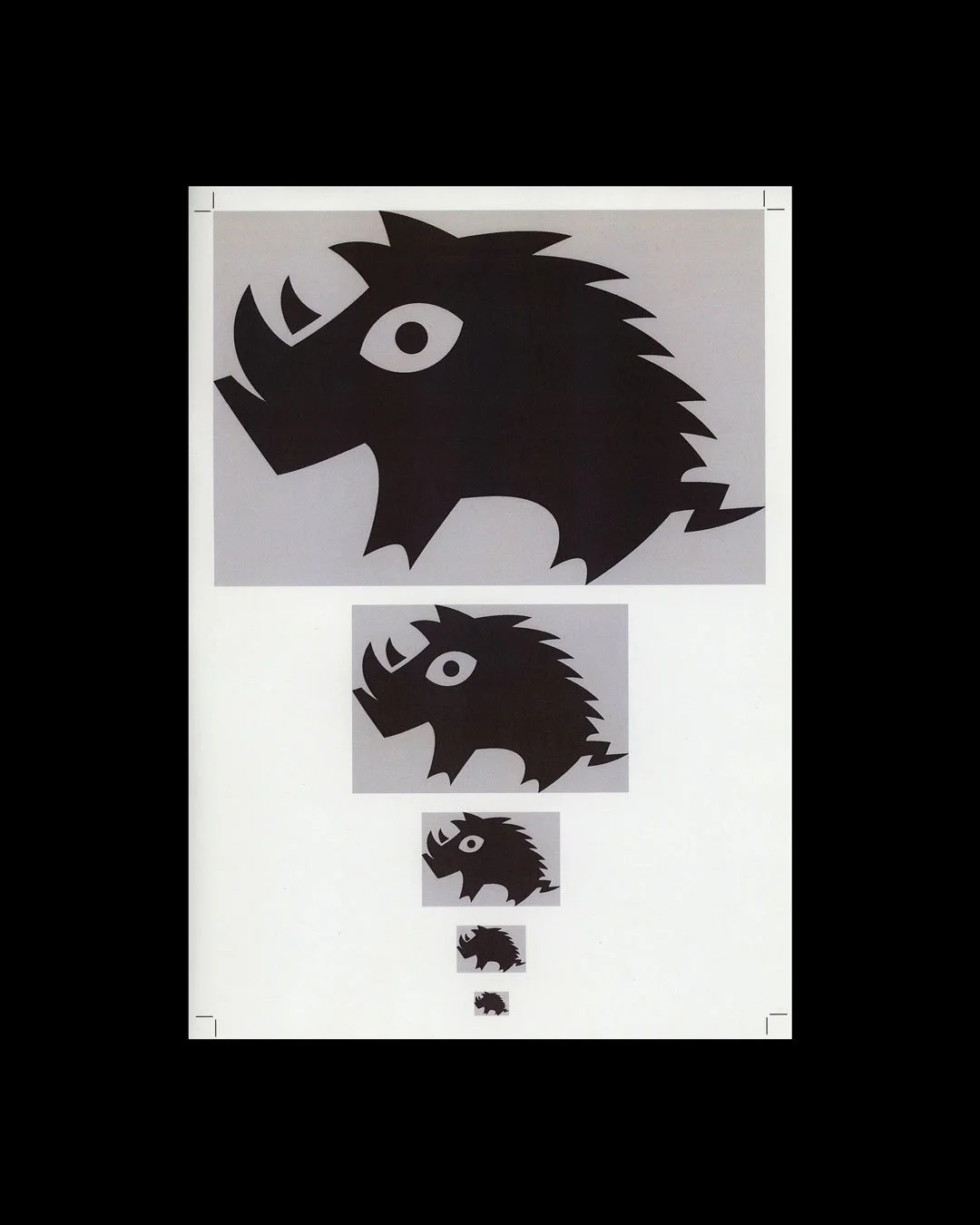
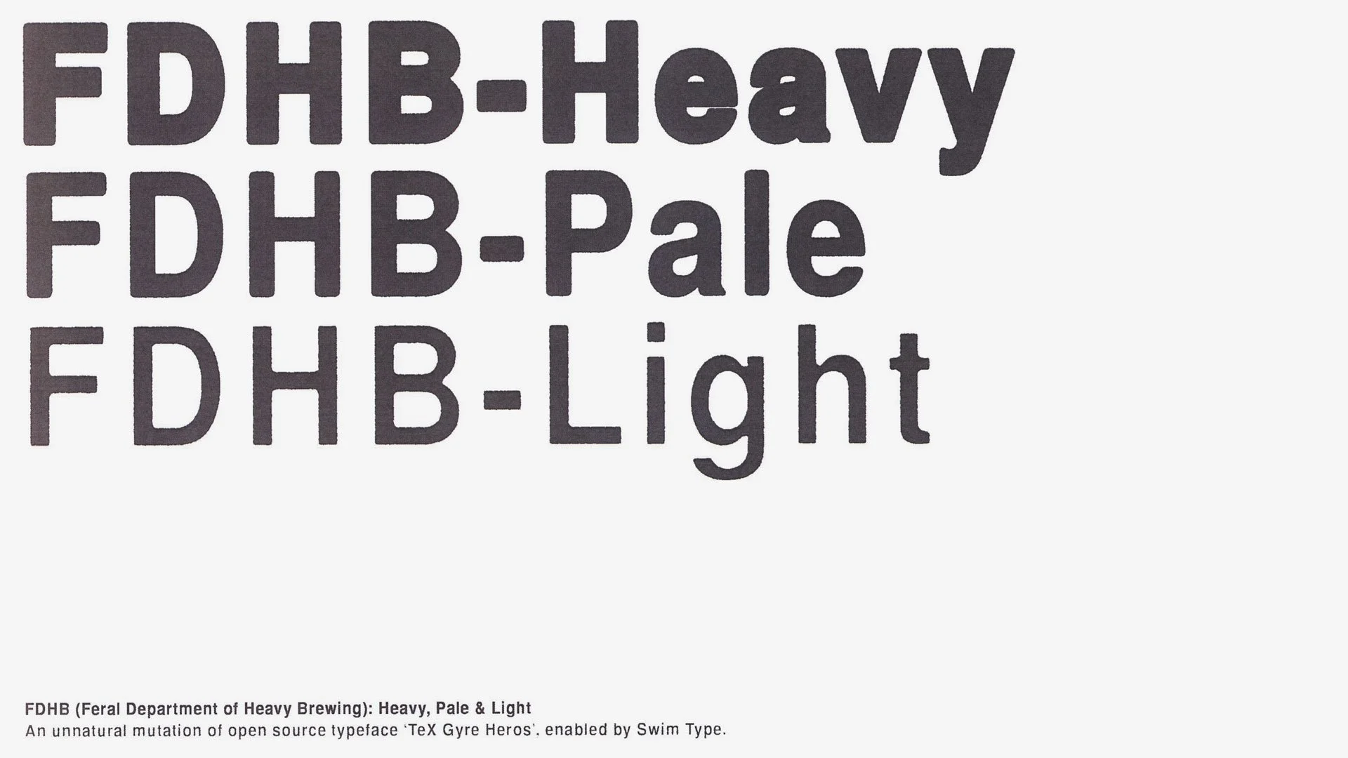
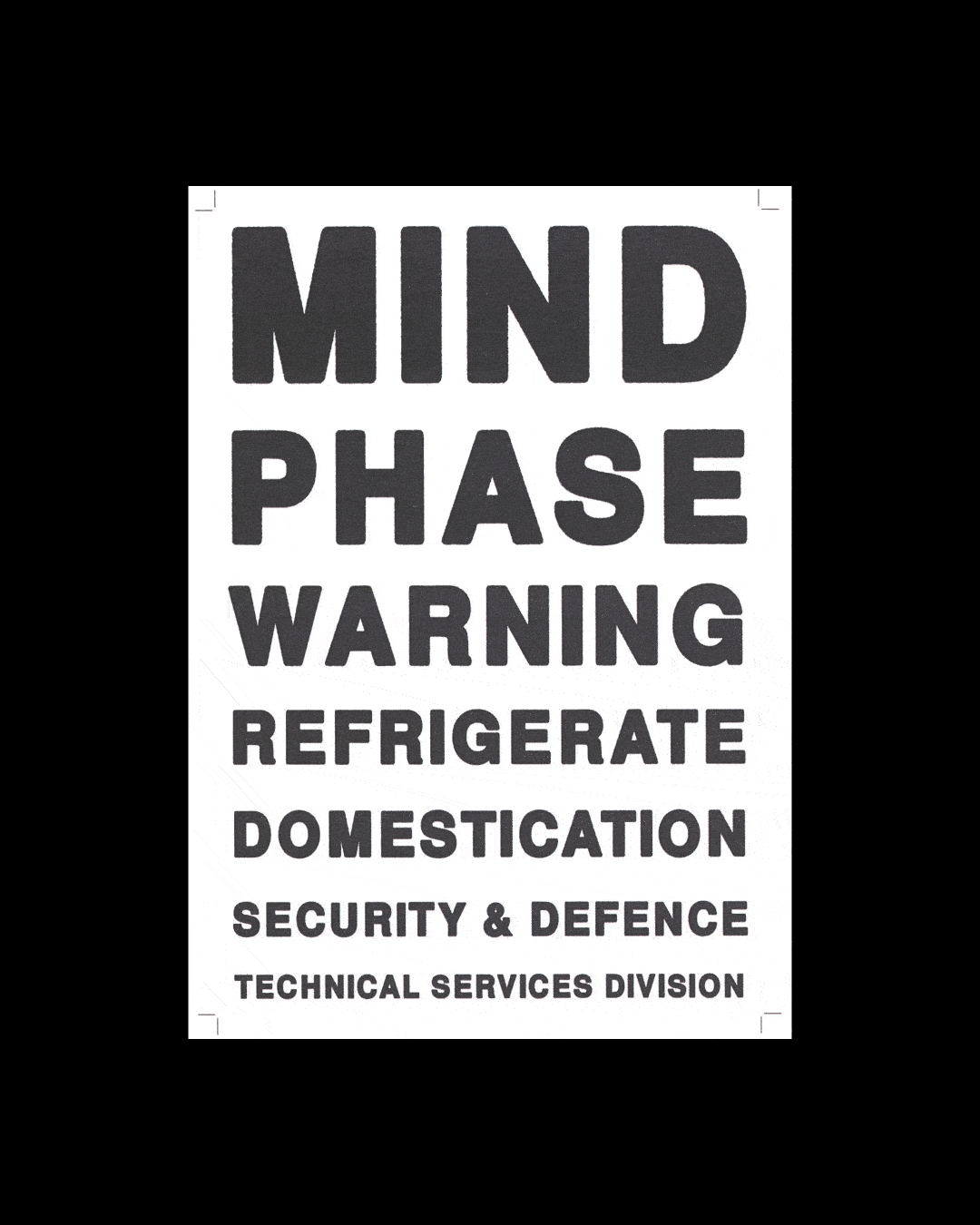
The Feral hog from 2002 is back, redesigned for each beer to reflect its style and strength. Each can is fronted by custom type, visualising the story behind each beer — from lab-grown to nuclear-tested. Two custom typefaces were also produced for the brand: a crude and utilitarian sans titled ‘FDHB’ for text; and ‘Feral LAB’, a dot-matrix inspired serif typeface for display use.
The system is designed to evolve with the brand, like a creature adapting to a changed environment, Feral is mutating to survive — and to thrive. Welcome to the new era of Feral. Return to wild.


Credits
Creative direction: Dan St Vincent, Duncan Wright
Design direction, illustration, custom type & animation: Joseph Dennis
Design: Vaughn Hockey, Thomas Earnshaw
Copywriter: Dan St Vincent
Special thanks: Alexis Waller, Samuel Byrnes, Nathanael Whale