Westralia: Designing a typeface in a state of distance, isolation and long drives.
Purchase available on request.
Retail Typeface
2019

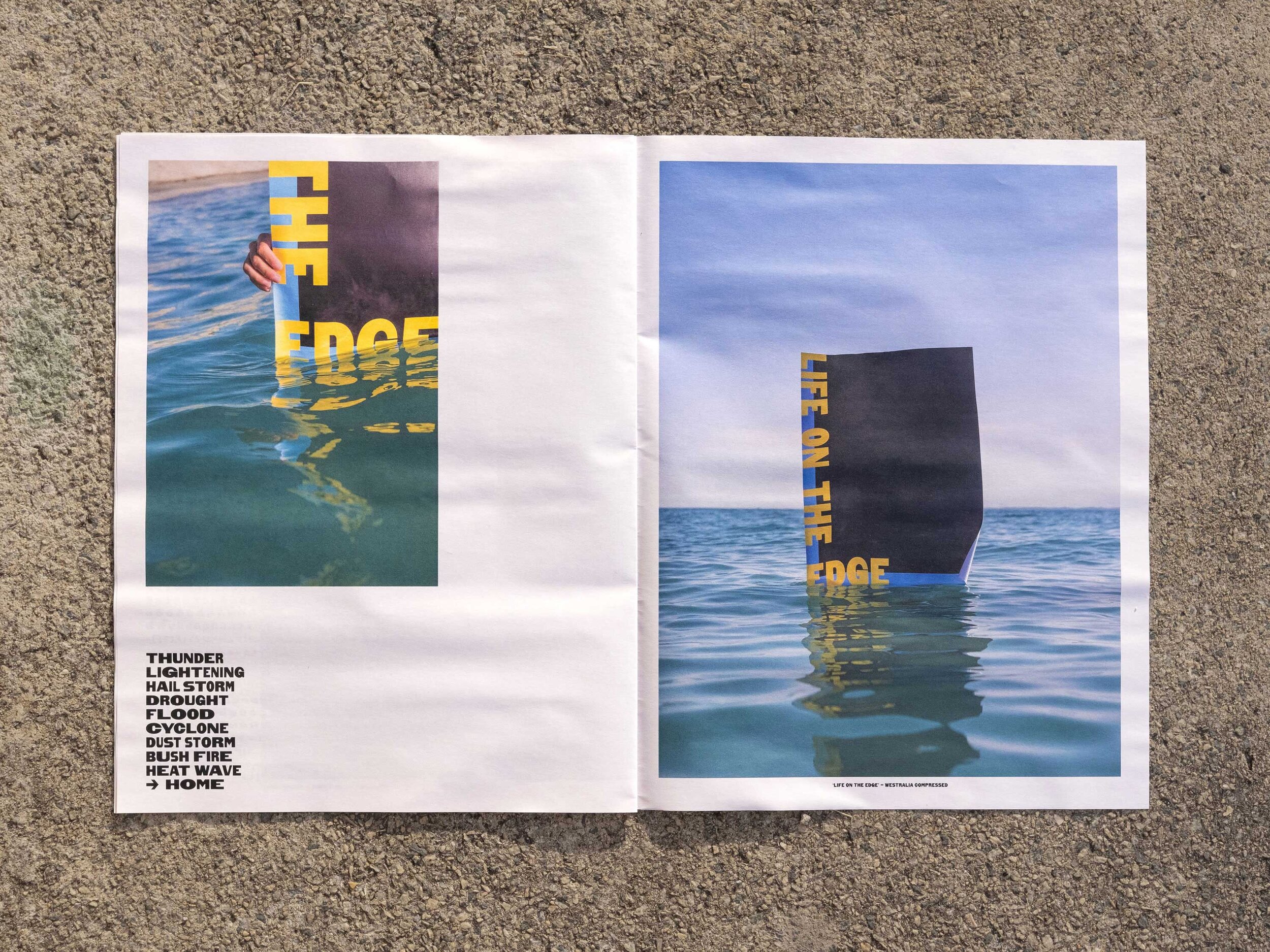
My home, Perth, Western Australia, is the most isolated city in the world. Westralia is inspired by this wide open land: a state of distance, isolation, long drives and great bights. It is a variable typeface, with a single axis transitioning between compressed and expanded, allowing multiple widths within the one word, giving it a rippled, unsettled feel. It is welcoming and authoritative, using the bold, crude nature of the letterforms to give it a taste of WA.


The Westralia type family has been designed to feel of its environment. With crude geometry and raw attitude, it is home amongst the rust-coloured rocks, the burning sand, the tall gums and the crashing waves. It’s made to be eroded, to fade, to change and to grow.
See it in use in Communication Arts Magazine in Block Branding’s work for the Black Swan State Theatre Company of WA.
Featured in Inspofinds second printed collection.


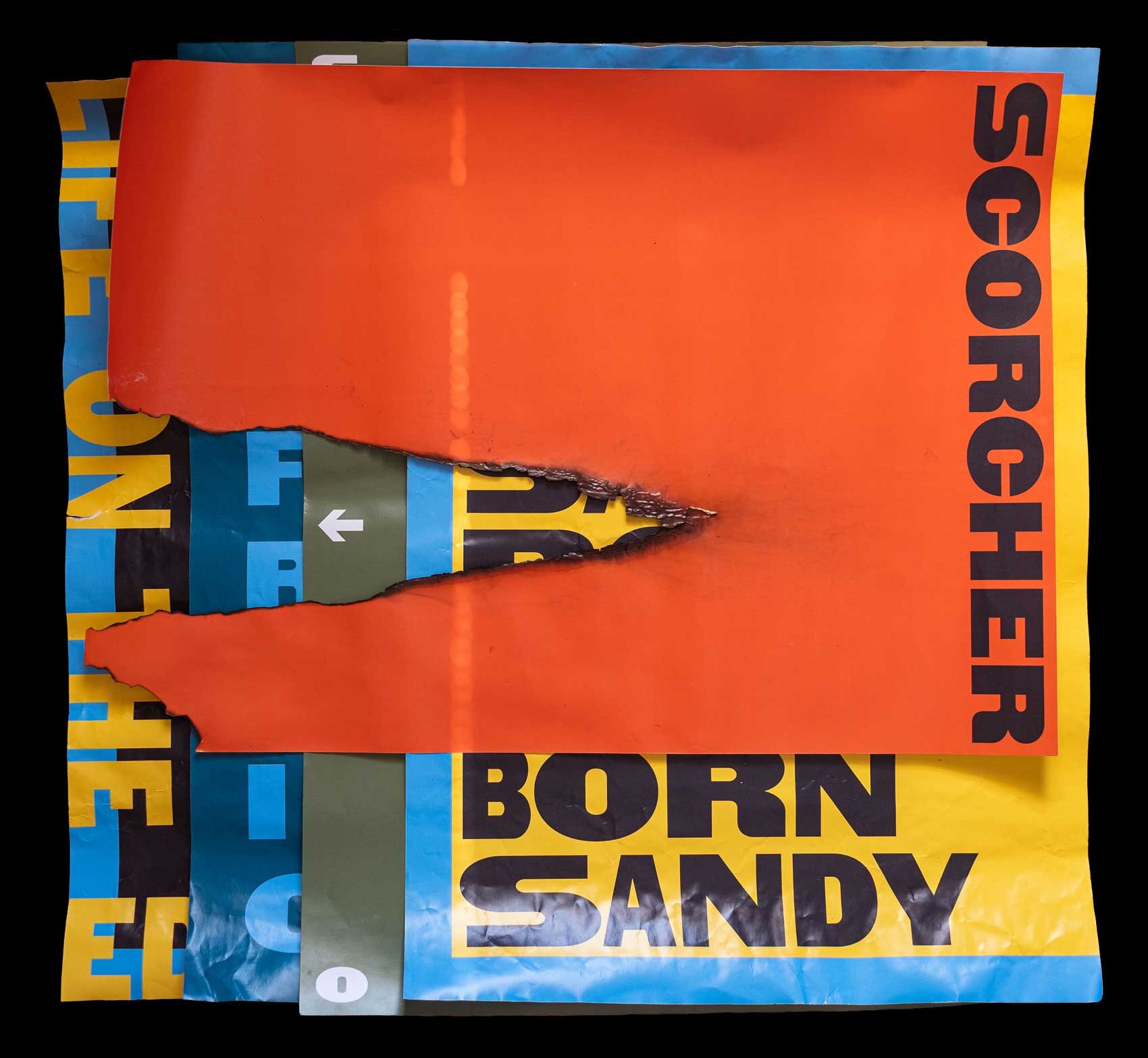
Post-shoot Posters

Credits
Typeface Design, Art Direction, Specimen Design: Joseph Dennis
Photography: Joseph Dennis & Kate McVey
Specimen Printed by: The Newspaper Club
Thanks to Michael, Kate, Anna, Zeb and Dad.
Awards
2020 AGDA Awards:MERITPrint: Catalogues & Brochures